
The Entrepreneur’s Guide to Design
Make Navigation Intuitive
When it comes to navigation, keep it as simple as possible: this is not the place to get creative. You don’t want to make your customers have to guess how to navigate your site. To make your navigation easy to understand, it should have a clear Call-To-Action. This could be your cart/checkout for an ecommerce store, or a clear ‘hire us’ button if you’re a service company. If your customers don’t know how to find what they are looking for, they’ll simply leave your site, and you’ll lose sales. So, don’t get creative trying to come up with fancy new navigation patterns that customers haven’t seen before. Don’t make your customers jump through hoops: instead make it clear, simple, and easy to understand. Here are a few common navigation patterns you can use that your customers will be familiar with:

1. The Importance of Clear Navigation
Navigation is like the backbone of your website. It helps users quickly find what they’re searching for, making their experience smooth and enjoyable. The easier it is for users to find their way around, the more likely they are to engage with your content and return in the future.
Quick Win: List the most important sections or pages of your website. They should be the pillars of your navigation menu. If you have too many, consider creating drop-downs or sub-menus for related items.
2. The F-Pattern & Z-Pattern Reading Behaviors
Users often scan websites in predictable patterns. The F-Pattern is common for content-heavy sites (like blogs), where users read in horizontal lines, then scan down the left side. The Z-Pattern is typical for visually-driven sites, where users scan from top-left to top-right, then diagonally to bottom-left, and across to bottom-right.
Quick Win: Design your navigation to fit these patterns. Put essential items at the top-left or top-right for easy visibility.
3. Keep It Simple and Consistent
Your navigation should be uncomplicated and consistent across all pages. Avoid using fancy jargon. If it's a contact page, label it as "Contact", not "Get in Touch" on one page and "Reach Out" on another.
Quick Win: Perform a quick audit of your website's menu. Is it the same on every page? If not, it's time to standardize.
4. Feedback & Interaction
When users hover over a menu item, it should change color, show an underline, or have some animation to show it's interactive. These small visual cues improve user experience by providing feedback.
Quick Win: Hover over your website’s menu items. Do they provide any visual feedback? If not, adding subtle animations or color changes can elevate the user experience.

5. Mobile Matters
With more and more people accessing websites via smartphones, it’s crucial to ensure that your navigation is mobile-friendly. This might mean having a hamburger menu or a simpler menu on mobile views. Check your website on your phone. Can you easily navigate through the pages? If it feels cramped or confusing, consider redesigning it for mobile.
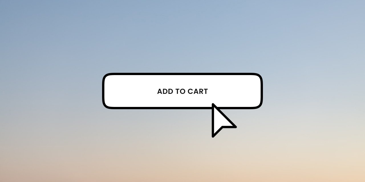
Quick Win: Make sure your navigation’s CTA is clear; for example, if you have an online shop, make sure your Cart/Checkout is easy to find. The longer it takes your customers to find the checkout, the more time they have to rethink their purchase.
Navigation Recap
Effective navigation is more than just a list of links; it’s about creating a seamless journey for your users. Remember, the smoother the journey, the longer your visitors will stay.
Design Resources For You
There are a lot of great resources out there to get you started. Many of them are free: here are some resources that can help you with your navigation.


The 7 Design Principles
-
Design Great CTAs
Design CTAs that convert.
-

Design Effective Typography
Get tangible tips for improving your product’s typography.
-

Use Color with Intent
Color can help introduce your brand, show your personality, and help with conversions.
-

Make Navigation Intuitive
Make it easy for your customers to find what they are looking for.
-

Create Pixel-Perfect Layouts
Build layouts that not only look great but work better for your users.
-

Make the Most of Social Proof
Word of mouth is everything: leverage it.
-

Start with the customer experience first, and work backwards from there
Set your customer experience as your Northstar.